Business Metrics
Overview
Business metrics provide high-level insights into workflow health, tracking performance through key indicators like conversion rates and automation efficiency.
This guide helps administrators monitor process effectiveness, identify bottlenecks, and optimize operations.
Purpose & use case
- Who is this for? Product Managers, Support Users and Reviewers.
- When should this be used?
- Monthly performance reviews
- Process optimization initiatives
- Client-specific workflow analysis (for HyperVerge)
Step-by-step guide
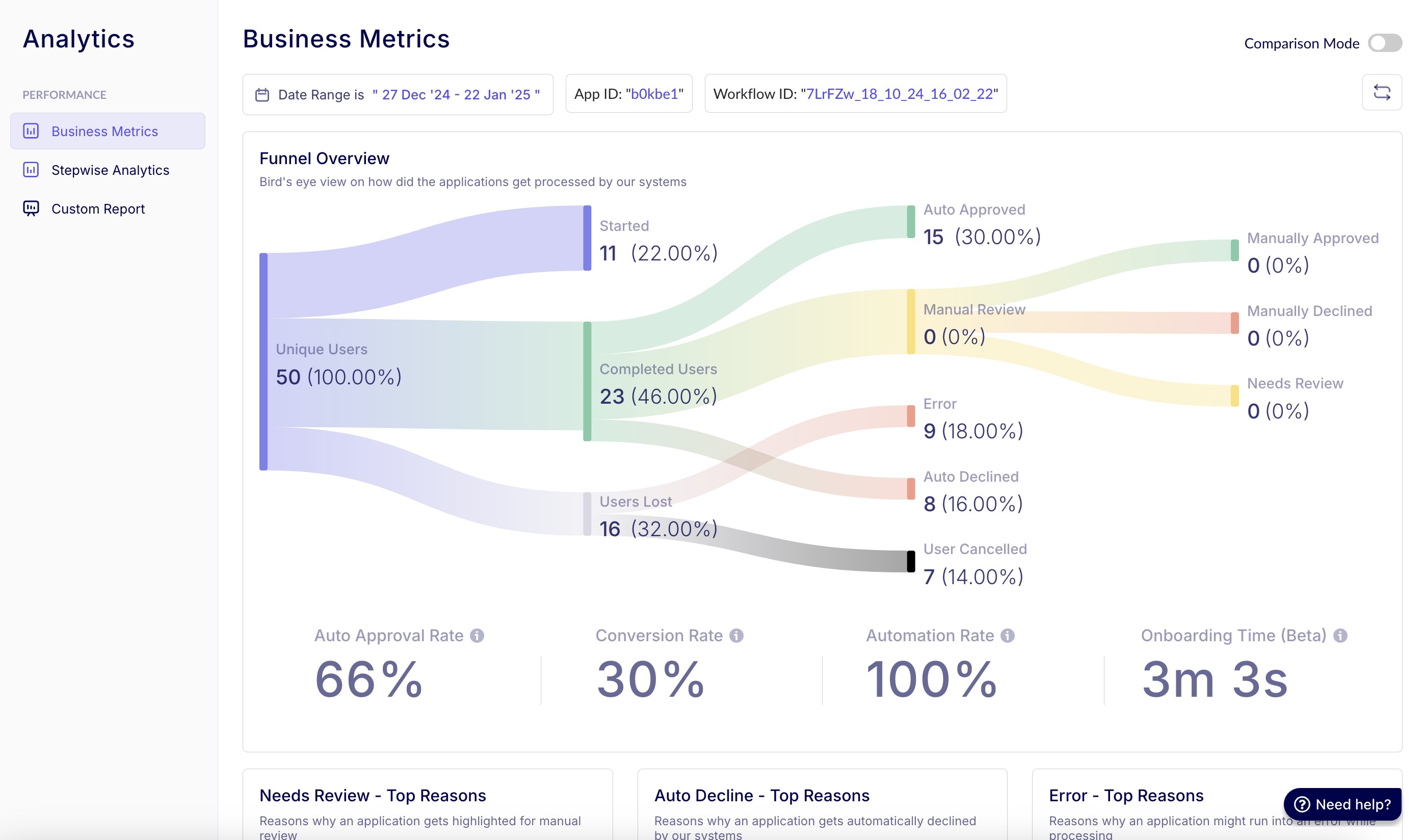
1. Funnel Overview graph
Components:
- Width: The width of each stage visually represents the volume of applications.
- Narrowing: The narrowing between stages reflects the attrition or approval rates as applications move through the process — or how users drop off as they move through the process.
- Color Coding:
- Green: Approved (Auto/Manual)
- Red: Rejected / Errors
- Yellow: Manual Review
Insights:
- Help in identifying the volume of applications in each end state.
- You can also get specific insights on top reasons for reaching any end state.
- Compares stage efficiency across time periods/workflows.
Filters available
- Date Range: Filter insights based on a specific timeframe, such as the last 14 days.
- App ID: Select a specific app ID (application identifier) if multiple are available, e.g.,
"b0kbe1". Fetches the data for a particular business unit or combined business units, depending on client requirements. - Workflow ID: View data across all workflows or drill down into a specific workflow through its unique ID.
Comparison mode (comparison view)
- Enables side-by-side analysis of two workflows (A vs. B) to understand user conversion differences.
- Helps in benchmarking approval rates, identifying inefficiencies, and optimizing workflows based on real-time data.
2. Key metrics
| Metric | Formula | Purpose |
|---|---|---|
| Conversion Rate | (Manual + Auto Approved) / Unique Users | Measures overall success rate |
| Auto Approval Rate | Auto Approved / (Auto Approved + Auto Declined + Review) | Gauges system accuracy |
| Automation Rate | (Auto Approved + Rejected) / Total Processed | Shows hands-off efficiency |
| Onboarding Time | Median completion time | UX performance indicator |
3. Top-reasons hotspots
Analysis method:
# Percentage Contribution Formula
(reason_count / total_issues) * 100
Common categories:
- Manual Review Triggers
- Document blur
- ID expired
- Face mismatch
- Auto-Rejection Causes
- Fraud flags
- Policy violations
- Errors
- API timeouts
- Data parsing failures
Action steps:
- Sort by highest percentage.
- Drill into temporal patterns.
- Compare across client/workflow segments.
FAQs
Q: Why use median for onboarding time? A: Reduces skew from outliers vs average.
Q: How often should metrics be reviewed? A: Weekly for ops teams, monthly for strategic analysis.